Friday 28 February 2014

Annette Messager


Homework booklets


For  Homework each week students are required to create their own fairytale based on the theme of a girl on a adventure. They will be required to illustrate an image of this and begin the to write the story. They are encouraged to use colour and some of the past learning of formal elements that they have previously been learning. The more effort the students put into this the higher their grade will be.

The use of Enchantment by Bruno Bettelheim

While undertaking this research assignment I am also interested in the idea of the value of the fairytale and what they truly mean. To help me further understand this I am reading The use of Enchantment by Bruno Bettelheim. Dr Bettelheim wrote this book to help adults become aware of the irreplaceable importance of fairytales. By revealing the true content of such stories he show how children may make use of them to cope with their baffling emotions, whether they be feelings of smallness and helplessness or the anxieties the child feels about strangers and the mysteries of the outside world. taking the best- known stories in turn, he demonstrates how they work, consciously or unconsciously, to support and free the child.

Student Feedback

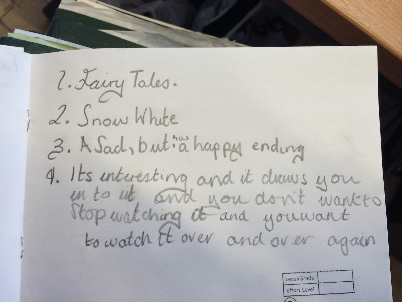
While developing my research assignment through fairy tales I am following the actions of Group One where there are six students that consist of two higher level learners, two middle and two lower. These six students were asked to create a spider diagram around fairytales and what it meant to them they were record with their permission for research purposes only and these were some of the outcomes of the recordings.

- One student led the group acting as the leader, letting students voice their opinion but persuading their views on particular fairytales.

- They were basing most of their knowledge of fairytales on movies they had watched.
- Within the movies Frozen and Tangle students were looking at areas they like and why.
- They all thought that the movies were interesting and had an element or romance, betrayal but had great adventures along the way with a clear moral throughout the story line.
- Most students could relate the movies back to a significant fairytale to look at further.
- One student like the idea of magic as it made her feel special.
- Within the story of tangle a couple of students liked the idea that the characters were not perfect and they could relate to this more.
- The final discussion to choose one fairytale was chosen by minority where they put their hands up.
- This group is now looking at the Frozen (Snow Queen).

5 Question Test

At the end of the first lesson students were assessed against what they were taught during the lesson. They individually had to answer five questions in their sketchbooks detailing what made fairytales special to them as a child. Below are the questions and some of the answers.


Spider Diagrams


Students were split into four different groups where there was six students in each. They were divided so their was two higher level students, two middle level learners and two lower level learners. In the groups students had to come up with their favourite fairy tales and what they liked about them. Out of this the students chose; Frozen (Snow Queen), Cinderella, Alice in Wonderland and Rapunzel.

Lesson One


Monday 24 February 2014

Chris Ofili

Chris Ofili
No Woman, No Cry 1998


Share this artwork

Artwork details

Artist
Chris Ofili (born 1968)
Title
No Woman, No Cry
Date1998
MediumOil paint, acrylic paint, graphite, polyester resin, printed paper, glitter, map pins and elephant dung on canvas
Dimensionssupport: 2438 x 1828 x 51 mm
Collection
Tate
AcquisitionPurchased 1999
Reference
T07502
Not on display

Display caption

No Woman No Cry is a tribute to the London teenager Stephen Lawrence. The Metropolitan police investigation into his racially motivated murder was mishandled, and a subsequent inquiry described the police force as institutionally racist. In each of the tears shed by the woman in the painting is a collaged image of Stephen Lawrence’s face, while the words ‘R.I.P. Stephen Lawrence’ are just discernible beneath the layers of paint. Despite these specific references, the artist also intended the painting to be read in more general terms, as a universal portrayal of melancholy and grief.
September 2008

Kara Walker


Pae White


William Morris

William Morris

Printed and woven textiles[edit]


Design for "Tulip and Willow" indigo-discharge wood-block printed fabric, 1873
Morris's first repeating pattern for wallpaper is dated 1862, but was not manufactured until 1864. All his wallpaper designs were manufactured for him by Jeffrey & Co, a commercial wallpaper maker. In 1868 he designed his first pattern specifically for fabric printing. As in so many other areas that interested him, Morris chose to work with the ancient technique of hand woodblock printing in preference to the roller printing which had almost completely replaced it for commercial uses.
Morris took up the practical art of dyeing as a necessary adjunct of his manufacturing business. He spent much of his time at Staffordshire dye works mastering the processes of that art and making experiments in the revival of old or discovery of new methods. One result of these experiments was to reinstateindigo dyeing as a practical industry and generally to renew the use of those vegetable dyes, such as the red derived from madder, which had been driven almost out of use by the anilines. Dyeing of wools, silks, and cottons was the necessary preliminary to what he had much at heart, the production of woven and printed fabrics of the highest excellence; and the period of incessant work at the dye-vat (1875–76) was followed by a period during which he was absorbed in the production of textiles (1877–78), and more especially in the revival of carpet-weaving as a fine art.[3][48] However, his first carpet designs of 1875, were made for him industrially by commercial firms using machinery.
Morris's patterns for woven textiles, some of which were also machine made under ordinary commercial conditions, included intricate double-woven furnishing fabrics in which two sets of warps andwefts are interlinked to create complex gradations of colour and texture.[49] His textile designs are still popular today, sometimes recoloured for modern sensibilities, but also in the original and bright colourways.

Tessa Farmer

TESSA FARMER

The Red Queen asks why we make art. Sculptor Tessa Farmer’s fairies may have one answer in their microworld of evolution in action.
Tessa Farmer’s fairies are invited to the court of the Red Queen
The Red Queen asks why we make art. Sculptor Tessa Farmer’s fairies may have one answer in their microworld of evolution in action.

Aubrey Beardsley

To that end, Aubrey Beardsley must be next on my list. He, in my opinion, brings out the darker side of fairy tales beautifully with his black-and-white (okay, mainly black and spidery) illustrations:
Lastly, I want to give a shout-out to two illustrators whose illustrations strike me as immediately classic. They look exactly like what, in my mind, classic fairy tale illustration should.

Mike Davis


Surreal Illustrations for Fairy Tales that Don't Exist Yet


Surreal Illustrations for Fairy Tales that Don't Exist YetSEXPAND
Mike Davis blends surrealism, religious iconography, Dutch portraiture, and a touch of fairy tale magic to create narrative paintings that seem to tell fantastical stories while stretching beyond the confines of a simple "Once upon a time."

Paula Rego

Paula Rego, 'Three Blind Mice'

Paula Rego
'Three Blind Mice'
1989
Print
Museum no. E.285-1990
Paula Rego was born in Lisbon in 1935 and trained at the Slade School of Fine Art in London in the 1950s. As Rego herself explained in 1965, she is inspired by 'caricature, items from newspapers, sights in the street, proverbs, nursery rhymes, children's games and songs, nightmares, desires, terrors'. Twenty-five years later she revisited the English nursery rhymes of her childhood with a series of etchings, which she made in honour of her infant granddaughter. Three Blind Mice is from that series, which was exhibited at the Marlborough Graphics Gallery in London in 1989.

Mat Collishaw


Mat Collishaw born 1966


Artist biography

English photographer, sculptor and filmmaker. He studied at Trent Polytechnic (1985–6), and then at Goldsmiths College, London (1986–9). For his first solo exhibition he created One Photo, Four Broads and a Stretcher, comprising a colour photographic reproduction of Watteau's L'Enseigne de Gersaint (1721; Berlin, Schloss Charlottenburg), greatly enlarged and cursorily attached to a wooden frame. By displaying a reproduction in this way, Collishaw highlights issues of representation, raised in the original painting through the juxtaposition of the false idyll of the fĂȘte galante, and the actualities of the art market. Much of Collishaw's subsequent work makes historical and art-historical references that hinge around the broad theme of the interaction between nature and culture. The ambiguous relationship between representation and reality is an underlying theme also of works involving the projection of videos into ‘real' environments. The technological prestidigitation behind these works is always slightly transparent, making viewers aware of their own complicity in being deceived. In other works Collishaw deals with disturbing subject-matter, presented in unexpected formats that both displace and reinforce the impact of the image. In the three-part series of photographsThe Awakening Conscience (1997), young girls are shown in woodlands surrounded by the remnants of alcohol and solvent abuse. The title is borrowed from a moralising painting by William Holman Hunt, and the images mimic the seductive, mysterious look of 19th-century photography; the highly contemporary nature of the girls' dilemma, however, suggests the difficulty of preserving innocence and the dangers of sentimentalising history.